Google+ gets an upgrade
According to their blog, the updates will make the social network: ” easier to use and nicer to look at, but most importantly, it accelerates efforts to create a simpler, more beautiful Google.”
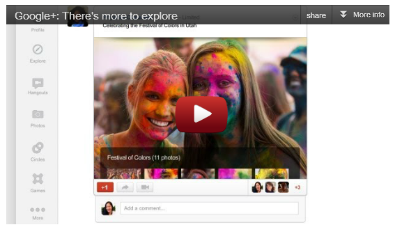
One of the first things you’ll notice about the new layout is a new way to get around the stream. Instead of static icons at the top, there’s a dynamic ribbon of applications on the left.
The news feed will detail larger photos, conversation “cards” that make it easier to scan and join discussions and a newsfeed “drawer” that looks similar to Facebook’s side bar that provides a rolling feed of updates.
The Google+ update extends beyond navigation, the stream and hangouts. For instance: there’s a new Explore page that shows what’s interesting and trending across the network. And a new profile with much bigger photos. And a new chat list that puts your friends front and centre.
In a word, the update has made the network a lot more social.
Talk to Tug about social media, email: ben.romberg@tugsearch.co.uk
Follow us on Twitter: @tugagency


