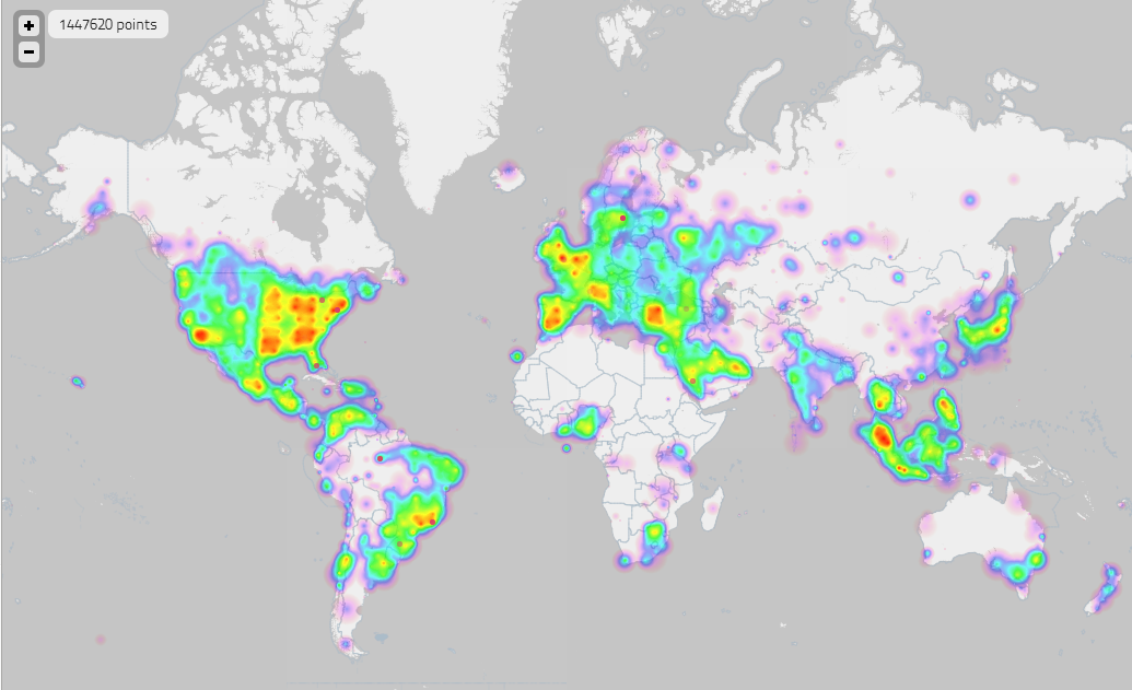
The One Million Tweet Map
It’s interesting to note there is no data captured from China, where Sina Weibo, a Chinese micro-blogging site, remains king. Couple that with the fact the Chinese remain extremely stringent with regards to their internet censorship, a lack of geolocalized data is understandable.
You could question what the benefits actually are of being able to display such data (apart from the awesome flashing lights and heat map toggle). Indeed, in the age of big data, being able to present digestible findings that allow for the interpretation of significances is a challenge that can usually be overcome by visualizations such as these. Data visualization though does come with its own difficulties, where different methods and presentation styles can lead to skewed and varied interpretations. Ultimately, these types of challenges are part of the struggle scientists and marketers consistently face with big data.


